The Org chart: Pigment offers a new reporting and data visualization tool

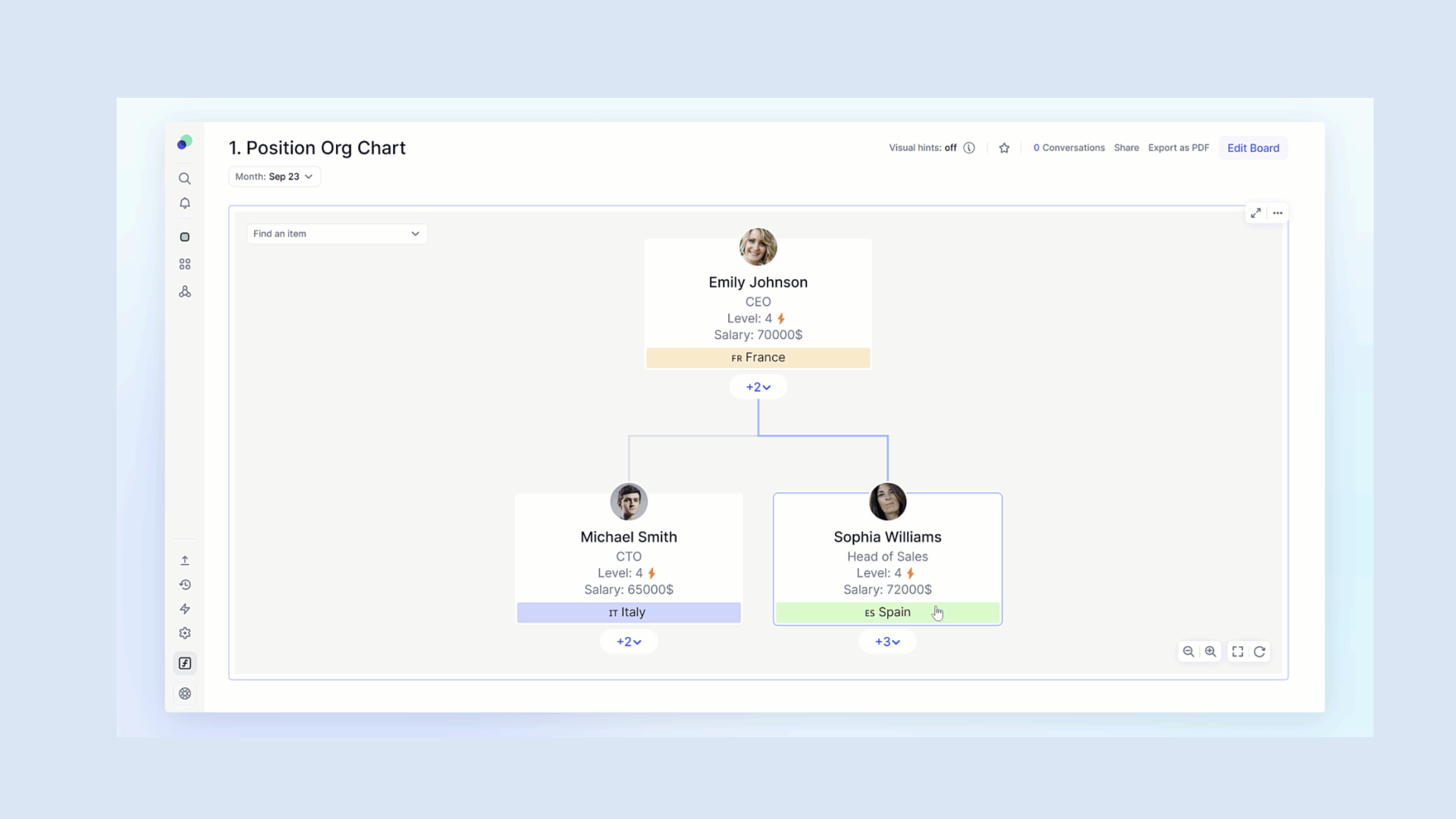
The Org chart is a powerful tool to visualize and manipulate hierarchies and team structure within your organization. Whether you’re a management controller, a human resource professional or the head of a growing organization, the Org Chart is an invaluable ally for better understanding and managing your organizational structures.
In this article, the MeltOne teams share with you the most effective way of interacting with the Org Chart, as well as advice on its configuration. You’ll be guided through setting up the Org Chart, while highlighting the benefits of the tool and the use cases you may encounter.
VISUALIZE YOUR ORGANIZATIONAL STRUCTURE

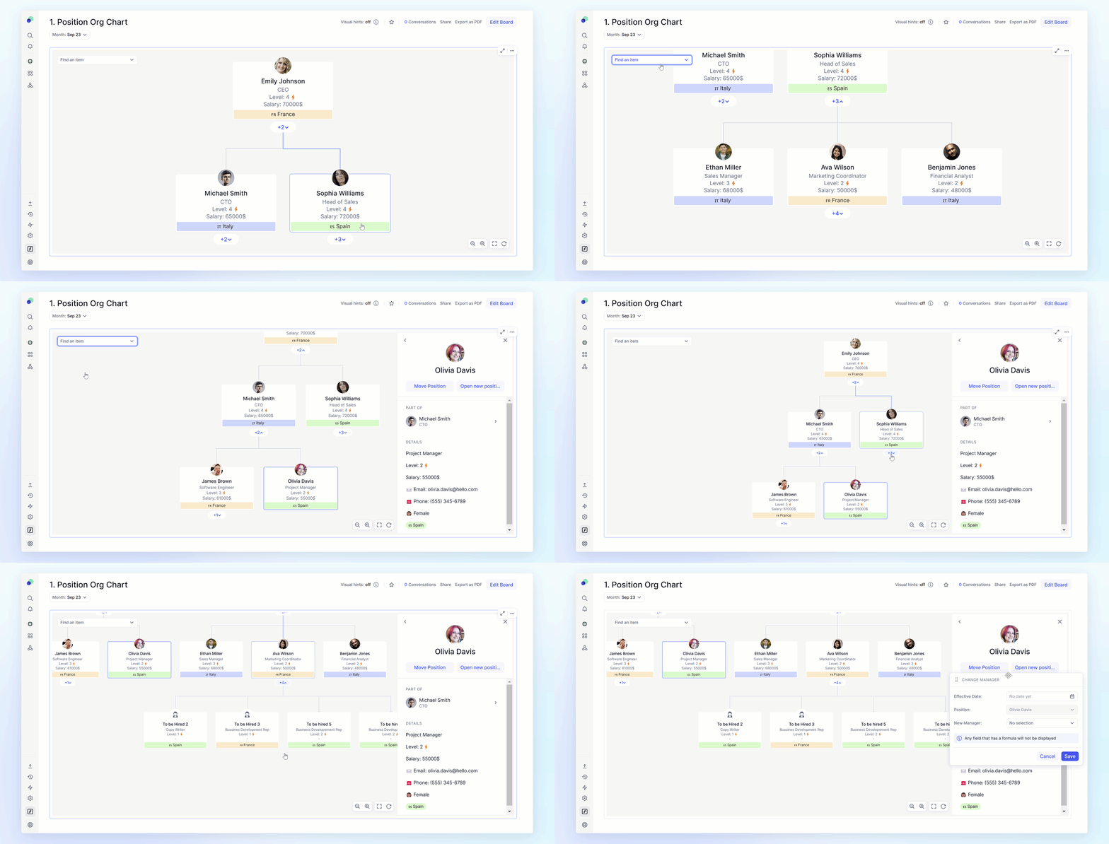
The Org chart is just as suitable for a large-scale company with numerous regional divisions, locations, or agencies, as it is for a human-scale company wishing to visualize the hierarchical relationships of its employees.
By clicking on a chart, a sidebar appears with the various information related to the selected organizational unit/collaborator, and in particular the children attached to it. A search bar in the top left-hand corner lets you quickly locate a specific element in the chart.
To set up an Org Chart, the first step is to identify the hierarchical elements within your company and create the appropriate dimensional lists. Next, you’ll need to create a table made up of different metrics, sized according to your needs, whether in terms of time, version, or other relevant criteria.
If the metrics you’re using have a different data type from that of the primary data, you’ll opt for a Group-based approach, with one metric per hierarchical group.
On the other hand, if your metrics have the same data type as your primary data, you’ll opt for a Reporting-based configuration.
CUSTOMIZE YOUR ORG CHART

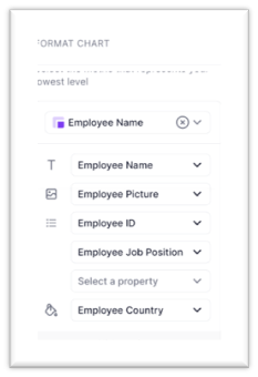
Using list properties or metrics, you can enrich your Org Chart with elements such as a title, an image, different types of sub-headings such as ID, position, or business sector (up to a maximum of three).
What’s more, you can customize the color according to categories such as country or department.
Other options include the possibility of displaying the first elements contained in a hierarchical group.
This allows direct visualization of the primary data

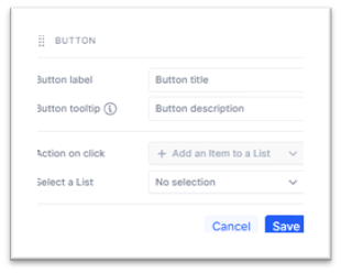
Action buttons can also be used to add elements via the org chart without having to go through a dimension list. After clicking on the action, a form appears.
This is particularly useful when changing jobs or adding a new headcount.
IMPROVING COMMUNICATION
The Org chart is a relevant communication tool. It makes it easy to present the organizational structure to all stakeholders, internal and external. You can highlight key relationships and clearly explain responsibilities. This strengthens the confidence of investors, partners and internal staff in your company’s financial management.
OPTIMIZING RESPONSIBILITIES
At a glance, you can identify who is responsible for each area. This simplifies the delegation of tasks and the distribution of responsibilities. In terms of financial planning, this optimization is crucial to allocate resources efficiently.
In summary, the Org Chart is a versatile tool that simplifies understanding of organizational structure, facilitates communication and offers numerous benefits for a variety of sectors and applications.
Pigment is a French performance management software (EPM) that enables Finance, HR and Revenue teams to plan their budgets and simulate their business in order to make the right decisions. The solution is currently used by companies in Europe and the United States.
If you would like to find out how MeltOne can help you implement your Org Chart, please contact us at: tchamant@meltone.com.
